Site Logo
Projects
Magpie | Responsive Mobile App
Ikigai | Native App
Sizzle | Responsive Web App
Frontend Development
Mobile Notes App
Illustration | Empty States Collection
About
item
Site Logo
item
Projects
Magpie | Responsive Mobile App
Ikigai | Native App
Sizzle | Responsive Web App
Frontend Development
Mobile Notes App
Illustration | Empty States Collection
About

CASE STUDY

Sizzle: A Responsive Web Recipe App
UX/UI Design


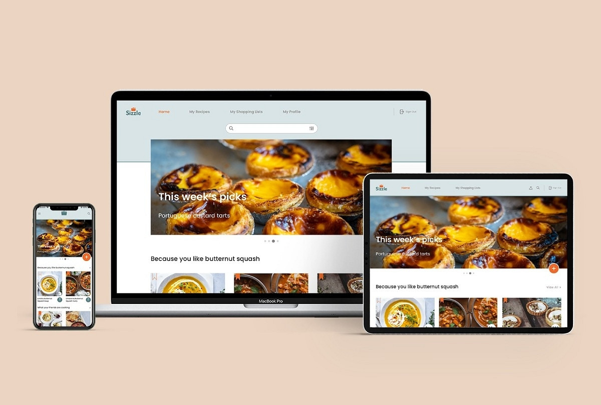
Sizzle is a simple recipe manager that allows the user to store, manage and share his/her recipes with ease. 

With a clean and simple aesthetic, curated content based on the user’s preferences and a function for one-click shopping lists, meal-planning is now something to look forward to.

TOOLS

Sketch
InVision
Photoshop

ROLE

UX Researcher
UI and Visual Designer

TIMELINE

November-December 2020
6 weeks

My Role

My role covered both UX and UI Design, allowing me to see the whole project through from start to finish with a cohesive approach.Through a thorough UX research phase, I identified the user requirements and ideated appropriate design solutions to address them.Progressing into the UI design phase of the project, I created moodboards, wireframes, style guides and mockups, taking into account crucial feedback from rounds of user testing, peers’ critiques and mentor reviews. The resulting responsive product is fresh, intuitive and fulfils the user requirements.

The Challenge

With this project, my aim was to create an intuitive recipe manager that would make it easy for the user to organise his/her recipes no matter what format they're in. 

The platform would allow the user to digitise any paper recipe or save existing ones from online resources in just a few steps and a function to create shopping lists would further improve the user experience. 

User Personas

I synthesised the findings from this user research into 3 compelling user personas, highlighting their backgrounds, needs and wants, pain points and behaviours.

As a keen cook myself, it was often tempting to come up with solutions to answer to my own needs and wants with this project. These user personas were crucial in helping me remain objective at all times, imagining the user at the centre of the experience rather than myself.

Click to view

Gathering Requirement

Drawing up a Minimum Viable Product document at this stage allowed me to make sense of my findings, identifying the needs from the wants, and giving the project a clear direction.  

 The product was to be intuitive, making recipe organisation a simple and enjoyable process. It would allow the user to import recipes from various sources (via the camera or through the web browser), include a one-click shopping list function, and inspire the user with recipes especially curated to suit their taste and preferences. 

Allowing the users to connect and interact with one another through the app will be a useful resource to measure the product’s success.

User Flows

In order to best address the user requirements, I created three simple user flows highlighting each step required for the users to achieve their goals.

I focused on solving their problems as quickly and efficiently as possible, reducing the amount of steps required in each scenario. 

Sketches and Paper Prototypes

Using the Crazy 8’s strategy, I proceeded to sketching initial ideas for the main screens that would need further developing. 

After several rounds and iterations, I created simple paper prototypes that I tested on three users. 
Taking into account the participants’ feedback, I compiled a synthesis of the findings and identified solutions for the problems that arose. 

 As a whole, the feedback emphasised a need for simplicity: for example I removed the ‘Recipe Saved’ notification that the participants felt was superfluous. 

Wireframes

Entering the UI phase of the project, I created digital wireframes that I was able to share with peers for review.

Suggestions that the menu bar at the bottom of each screen should be removed came up a few times. Indeed the reviewers preferred to give the content more space with a hidden menu instead, which would also be more readily adaptable for bigger devices. Those adjustments were later incorporated in my hi-fidelity wireframes.

Aesthetic Direction

I placed the need for simplicity at the centre of the product’s aesthetic. The colour palette is fresh and crisp, and the typography choice enhances clarity.

Inspired by contemporary cookbooks like Anna Jones' A Modern Way to Cook, I focused on a minimalist approach to emphasise practicality. 

The product works like a favourite cooking utensil: simple, reliable and authentic.

With an overwhelming choice of recipe apps already in existence, Sizzle goes back to basics, therefore allowing for a pain-free and efficient user experience.

Click to view
Click to view

From Mobile-First to a Fully Responsive Design

Adopting a mobile-first approach, I ensured my design solutions were effective for smaller devices. Hamburger menus and floating action buttons provided crucial space-saving solutions and allowed for a clutter-free navigation on mobile screens.

With a functional design in place for the smaller screens, I went on to develop the fully responsive design. To help me in this process, I used a comprehensive style guide compiled throughout the UI phase of the project and built responsive grids to adapt the layout for critical breakpoints.

A final round of peers’ reviews highlighted the need for further improvements, such as a contrast issue in the menu bar on the larger screens and unnecessary use of gradients on the Home screen banner image. 

With these final tweaks addressed and incorporated, the final design is clean and simple, respecting the overall aesthetic direction of the project. It adapts naturally to all screen sizes, making the product widely accessible to suit different contexts of use

Insights

Given more time, I believe the project could have benefitted from another round of user testing, perhaps with a different technique such as focus groups.

Ideally, peers’ and experts’ reviews should have been conducted earlier so the decision to discard the bottom menu bar could have been implemented in the project before the wireframes got digitised.

My peers’ advice were instrumental in the decision to implement some finer details I could have easily missed otherwise.

Future Development

To further the product’s reach, future phases of development should include some of the wants that were identified at the gathering requirement phase of the project.

Functions such as video tutorials for cooking tips and advanced techniques, and suggested substitutions for missing ingredients would enhance the user experience.

Thank you for reading

  • Previous
  • Next

GET IN TOUCH!

hello@gaellemonin.com

© 2021 Gaelle Monin

Made with Pixpa
Share
http://www.gaellemonin.com/projects/sizzle-case-study1 Copied